SHOWCASING A FRESH EXPRESSION OF CANADIAN CUISINE

" width="156.04958454581902px"><path d="M 3.532 38.92 L 3.532 35.377 L 1.761 35.377 L 1.761 30.084 L 0 30.084 L 0 14.151 L 1.761 14.151 L 1.761 8.847 L 3.532 8.847 L 3.532 5.304 L 5.304 5.304 L 5.304 10.619 L 3.532 10.619 L 3.532 33.616 L 5.304 33.616 L 5.304 38.92 Z M 5.304 5.304 L 5.304 1.761 L 7.076 1.761 L 7.076 5.304 Z M 5.304 42.462 L 5.304 38.919 L 7.076 38.919 L 7.076 42.462 Z M 7.076 1.761 L 7.076 0 L 8.847 0 L 8.847 1.761 Z M 7.076 44.234 L 7.076 42.462 L 8.847 42.462 L 8.847 44.234 Z" fill="rgb(0, 0, 0)" height="44.2339986688985px" id="L8e3iDP9Y" width="8.847167862166316px"/><path d="M 0 0 L 21.903 0 L 21.903 3.541 L 3.982 3.541 L 3.982 13.497 L 19.779 13.497 L 19.779 17.036 L 3.982 17.036 L 3.982 28.098 L 22.434 28.098 L 22.434 31.639 L 0 31.639 Z" fill="rgb(0, 0, 0)" height="31.63890448912251px" id="uF8ciPEkL" transform="translate(21.148 5.58)" width="22.434088610192703px"/><path d="M 0 0 L 3.982 0 L 3.982 31.638 L 0 31.638 Z" fill="rgb(0, 0, 0)" height="31.637982717053717px" id="kKbFASvkc" transform="translate(45.952 5.58)" width="3.9820553371700953px"/><path d="M 5.925 29.662 L 5.925 27.683 L 3.946 27.683 L 3.946 25.705 L 1.967 25.705 L 1.967 21.746 L 0 21.746 L 0 9.883 L 1.967 9.883 L 1.967 5.937 L 3.946 5.937 L 3.946 3.958 L 5.925 3.958 L 5.925 1.98 L 9.883 1.98 L 9.883 3.958 L 7.904 3.958 L 7.904 5.937 L 5.925 5.937 L 5.925 9.883 L 3.946 9.883 L 3.946 21.746 L 5.925 21.746 L 5.925 25.705 L 7.904 25.705 L 7.904 27.683 L 9.883 27.683 L 9.883 29.662 Z M 25.692 7.903 L 25.692 5.936 L 23.725 5.936 L 23.725 3.957 L 21.746 3.957 L 21.746 1.979 L 9.882 1.979 L 9.882 0 L 25.692 0 L 25.692 3.958 L 27.671 3.958 L 27.671 7.904 L 25.692 7.904 Z M 9.882 31.629 L 9.882 29.662 L 21.746 29.662 L 21.746 27.683 L 23.725 27.683 L 23.725 19.766 L 18.776 19.766 L 18.776 17.798 L 29.65 17.798 L 29.65 19.766 L 27.671 19.766 L 27.671 29.662 L 25.692 29.662 L 25.692 31.629 Z" fill="rgb(0, 0, 0)" height="31.628764366451918px" id="yWBmt_tt0" transform="translate(53.912 5.59)" width="29.649720511888518px"/><path d="M 0 0 L 3.982 0 L 3.982 13.452 L 20.886 13.452 L 20.886 0 L 24.868 0 L 24.868 31.638 L 20.886 31.638 L 20.886 16.991 L 3.982 16.991 L 3.982 31.638 L 0 31.638 Z" fill="rgb(0, 0, 0)" height="31.637982717053717px" id="ycEkkWgoG" transform="translate(87.778 5.58)" width="24.867566871795134px"/><path d="M 10.531 3.541 L 0 3.541 L 0 0 L 25.045 0 L 25.045 3.541 L 14.513 3.541 L 14.513 31.638 L 10.531 31.638 Z" fill="rgb(0, 0, 0)" height="31.637982717053717px" id="fNwDIYwea" transform="translate(114.681 5.58)" width="25.04454710900427px"/><path d="M 0 1.761 L 0 0 L 1.761 0 L 1.761 1.761 Z M 0 44.234 L 0 42.462 L 1.761 42.462 L 1.761 44.234 Z M 1.761 5.304 L 1.761 1.761 L 3.532 1.761 L 3.532 5.304 Z M 1.761 42.462 L 1.761 38.919 L 3.532 38.919 L 3.532 42.462 Z M 3.532 38.92 L 3.532 33.616 L 5.304 33.616 L 5.304 10.619 L 3.532 10.619 L 3.532 5.304 L 5.304 5.304 L 5.304 8.847 L 7.076 8.847 L 7.076 14.151 L 8.847 14.151 L 8.847 30.084 L 7.076 30.084 L 7.076 35.377 L 5.304 35.377 L 5.304 38.92 Z" fill="rgb(0, 0, 0)" height="44.2339986688985px" id="U_YZpgvv7" transform="translate(147.202 0)" width="8.847176708904954px"/></g></svg>)
Food & Beverage
[ 2019-2026 ]
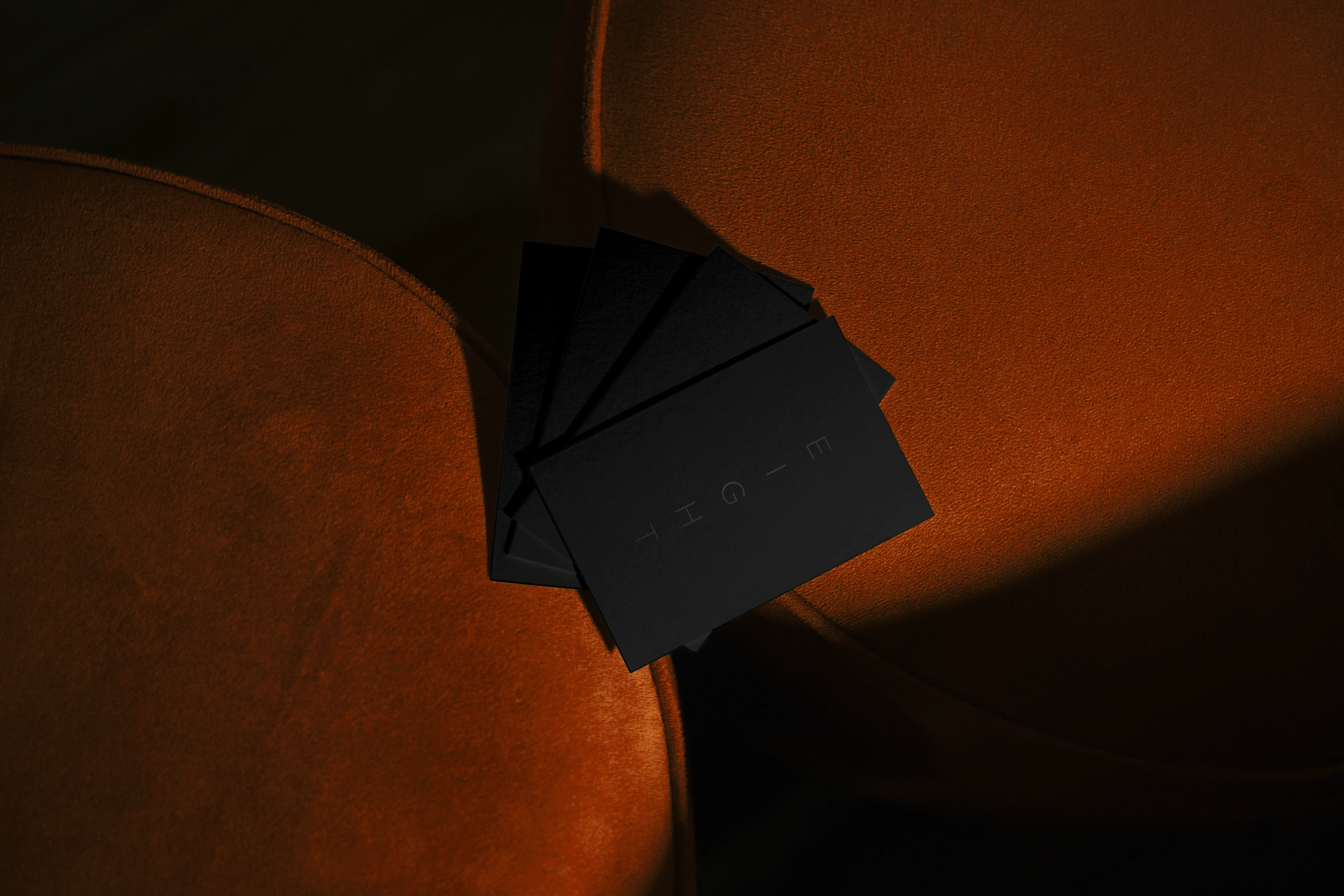
Showcasing a fresh expression of Canadian cuisine, EIGHT hopes to spark an evening-long dialogue with its guests around Canadian food and what it means to call this nation home. EIGHT’s brand exploration aimed to serve as an extension of their through line: being a catalyst for conversation and, most importantly, an exploration of what Canadian food is and will be. The EIGHT logo is comprised of two elements – the wordmark and monogram. The wordmark speaks to EIGHT’s simplicity, quality, and attention to detail. The deer is a quintessential piece of Alberta, as the icon is broken into eight parts – reflecting the 8 seats, 8 courses, and the use of locally sourced ingredients in the tasting menus.
Services
Brand Identity Creative Direction Print Social Web Design
Role
Lead Designer
Team
Alannah P., Support Designer Carly D., Project Manager Bree H., Project Manager Camilo T., Project Nanager Shaylon H., Developer
Agency
BLKWTR Creative
Showcasing a fresh expression of Canadian cuisine, EIGHT hopes to spark an evening-long dialogue with its guests around Canadian food and what it means to call this nation home. EIGHT’s brand exploration aimed to serve as an extension of their through line: being a catalyst for conversation and, most importantly, an exploration of what Canadian food is and will be. The EIGHT logo is comprised of two elements – the wordmark and monogram. The wordmark speaks to EIGHT’s simplicity, quality, and attention to detail. The deer is a quintessential piece of Alberta, as the icon is broken into eight parts – reflecting the 8 seats, 8 courses, and the use of locally sourced ingredients in the tasting menus.
Services
Brand Identity Creative Direction Print Social Web Design
Role
Lead Designer
Team
Alannah P., Support Designer Carly D., Project Manager Bree H., Project Manager Camilo T., Project Nanager Shaylon H., Developer
Agency
BLKWTR Creative
Showcasing a fresh expression of Canadian cuisine, EIGHT hopes to spark an evening-long dialogue with its guests around Canadian food and what it means to call this nation home. EIGHT’s brand exploration aimed to serve as an extension of their through line: being a catalyst for conversation and, most importantly, an exploration of what Canadian food is and will be. The EIGHT logo is comprised of two elements – the wordmark and monogram. The wordmark speaks to EIGHT’s simplicity, quality, and attention to detail. The deer is a quintessential piece of Alberta, as the icon is broken into eight parts – reflecting the 8 seats, 8 courses, and the use of locally sourced ingredients in the tasting menus.
Services
Brand Identity Creative Direction Print Social Web Design
Role
Lead Designer
Team
Alannah P., Support Designer Carly D., Project Manager Bree H., Project Manager Camilo T., Project Nanager Shaylon H., Developer
Agency
BLKWTR Creative
The logo mark is comprised of 8 pieces


[ Location ] [ Circumstance ] [ Culture ]




Photos
DQ Studios
*Certain elements may have been adjusted and are not a full reflection of the approved design/assets. The purpose of this project entry is solely to accurately reflect current skills & design style.
©
2026