The governing body for tennis in Alberta
" width="288.16992267565547px"><path d="M 3.532 38.92 L 3.532 35.377 L 1.761 35.377 L 1.761 30.084 L 0 30.084 L 0 14.151 L 1.761 14.151 L 1.761 8.847 L 3.532 8.847 L 3.532 5.304 L 5.304 5.304 L 5.304 10.619 L 3.532 10.619 L 3.532 33.616 L 5.304 33.616 L 5.304 38.92 Z M 5.304 5.304 L 5.304 1.761 L 7.076 1.761 L 7.076 5.304 Z M 5.304 42.462 L 5.304 38.919 L 7.076 38.919 L 7.076 42.462 Z M 7.076 1.761 L 7.076 0 L 8.847 0 L 8.847 1.761 Z M 7.076 44.234 L 7.076 42.462 L 8.847 42.462 L 8.847 44.234 Z" fill="rgb(0, 0, 0)" height="44.234002459700385px" id="wjKwOEtom" width="8.84716831510741px"/><path d="M 10.531 3.541 L 0 3.541 L 0 0 L 25.045 0 L 25.045 3.541 L 14.513 3.541 L 14.513 31.638 L 10.531 31.638 Z" fill="rgb(0, 0, 0)" height="31.637982290330864px" id="KAA8C8zj6" transform="translate(18.538 5.58)" width="25.044546771210662px"/><path d="M 0 11.903 C 0 4.691 4.293 0 10.974 0 C 17.566 0 21.416 4.513 21.416 11.106 C 21.416 11.771 21.416 12.522 21.372 12.876 L 3.718 12.876 C 3.806 16.814 6.018 20.842 11.018 20.842 C 15.442 20.842 17.125 17.877 17.523 16.284 L 21.107 16.284 C 19.956 20.488 16.771 23.895 10.974 23.895 C 3.849 23.895 0 18.763 0 11.904 Z M 17.656 9.779 C 17.656 6.062 15.001 3.053 10.798 3.053 C 6.903 3.053 3.939 5.84 3.718 9.779 Z" fill="rgb(0, 0, 0)" height="23.895097009424056px" id="DrMUMEY7N" transform="translate(39.638 13.988)" width="21.416451864142886px"/><path d="M 10.177 3.097 C 6.195 3.097 3.54 5.619 3.54 9.114 L 3.54 23.186 L 0 23.186 L 0 0.619 L 3.54 0.619 L 3.54 3.319 L 3.628 3.319 C 4.823 1.726 7.212 0 11.061 0 C 15.176 0 18.628 2.256 18.628 7.433 L 18.628 23.186 L 15.088 23.186 L 15.088 8.318 C 15.088 5.398 13.717 3.097 10.176 3.097 Z" fill="rgb(0, 0, 0)" height="23.18625430559632px" id="bnXBYMnEw" transform="translate(63.362 14.032)" width="18.628091486911217px"/><path d="M 10.177 3.097 C 6.195 3.097 3.54 5.619 3.54 9.114 L 3.54 23.186 L 0 23.186 L 0 0.619 L 3.54 0.619 L 3.54 3.319 L 3.628 3.319 C 4.823 1.726 7.212 0 11.061 0 C 15.176 0 18.628 2.256 18.628 7.433 L 18.628 23.186 L 15.088 23.186 L 15.088 8.318 C 15.088 5.398 13.717 3.097 10.176 3.097 Z" fill="rgb(0, 0, 0)" height="23.18625430559632px" id="N2ZLZLwf2" transform="translate(85.285 14.032)" width="18.628091486911217px"/><path d="M 0 0 L 4.248 0 L 4.248 4.248 L 0 4.248 Z M 0.354 8.629 L 3.894 8.629 L 3.894 31.196 L 0.354 31.196 Z" fill="rgb(0, 0, 0)" height="31.195531369466813px" id="l4sdwdFbD" transform="translate(106.797 6.023)" width="4.247525635690181px"/><path d="M 0 15.663 L 3.717 15.663 C 3.894 18.407 5.486 20.708 10.132 20.708 C 14.469 20.708 15.487 18.717 15.487 16.991 C 15.487 13.894 12.257 13.584 9.469 12.965 C 5.532 12.08 0.885 11.018 0.885 6.327 C 0.885 2.522 3.938 0 9.115 0 C 14.956 0 17.965 3.186 18.319 7.08 L 14.603 7.08 C 14.249 5.355 13.364 3.098 9.161 3.098 C 5.974 3.098 4.602 4.382 4.602 6.195 C 4.602 8.806 7.479 9.071 10.621 9.78 C 14.647 10.709 19.204 11.86 19.204 16.86 C 19.204 21.108 15.886 23.807 10.133 23.807 C 3.628 23.807 0.133 20.311 0 15.665 Z" fill="rgb(0, 0, 0)" height="23.806606899524382px" id="IXx2KqHR5" transform="translate(112.566 14.033)" width="19.20419902213507px"/><path d="M 11.681 0 L 16.149 0 L 27.92 31.638 L 23.628 31.638 L 20.84 23.717 L 6.902 23.717 L 4.115 31.638 L 0 31.638 L 11.682 0 Z M 19.556 20.178 L 13.937 3.672 L 13.849 3.672 L 8.229 20.178 Z" fill="rgb(0, 0, 0)" height="31.637982294936258px" id="neoT8pANY" transform="translate(140.529 5.58)" width="27.91955381498883px"/><path d="M 0 0 L 3.54 0 L 3.54 31.638 L 0 31.638 Z" fill="rgb(0, 0, 0)" height="31.63798229033088px" id="cKPPSlpXG" transform="translate(169.839 5.58)" width="3.5396046964087873px"/><path d="M 3.628 28.718 L 3.54 28.718 L 3.54 31.638 L 0 31.638 L 0 0 L 3.54 0 L 3.54 11.859 L 3.628 11.859 C 4.955 10.133 7.079 8.452 10.708 8.452 C 16.373 8.452 20.886 12.921 20.886 20.355 C 20.886 27.788 16.373 32.257 10.708 32.257 C 7.079 32.257 4.955 30.665 3.628 28.718 Z M 17.168 20.355 C 17.168 15.93 15 11.549 10.353 11.549 C 6.15 11.549 3.539 15.044 3.539 20.355 C 3.539 25.665 6.15 29.16 10.353 29.16 C 15 29.16 17.168 24.78 17.168 20.355 Z" fill="rgb(0, 0, 0)" height="32.25741311680796px" id="o4wppy8kt" transform="translate(176.716 5.58)" width="20.885511252929064px"/><path d="M 0 11.903 C 0 4.691 4.293 0 10.974 0 C 17.566 0 21.416 4.513 21.416 11.106 C 21.416 11.771 21.416 12.522 21.372 12.876 L 3.718 12.876 C 3.806 16.814 6.018 20.842 11.018 20.842 C 15.442 20.842 17.125 17.877 17.523 16.284 L 21.107 16.284 C 19.956 20.488 16.771 23.895 10.974 23.895 C 3.849 23.895 0 18.763 0 11.904 Z M 17.656 9.779 C 17.656 6.062 15.001 3.053 10.798 3.053 C 6.903 3.053 3.939 5.84 3.718 9.779 Z" fill="rgb(0, 0, 0)" height="23.895097009424056px" id="VsRJYUsGX" transform="translate(198.74 13.988)" width="21.416451878088083px"/><path d="M 0 24.612 L 0 22.571 L 2.041 22.571 L 2.041 6.16 L 0 6.16 L 0 4.107 L 2.041 4.107 L 2.041 2.054 L 4.094 2.054 L 4.094 0 L 6.147 0 L 6.147 4.106 L 8.201 4.106 L 8.201 6.159 L 6.147 6.159 L 6.147 22.571 L 8.201 22.571 L 8.201 24.611 L 0.001 24.611 Z M 12.306 6.16 L 12.306 4.107 L 8.2 4.107 L 8.2 2.054 L 16.399 2.054 L 16.399 6.159 L 12.307 6.159 Z" fill="rgb(0, 0, 0)" height="24.612235691560134px" id="H4f75cCTp" transform="translate(221.269 12.606)" width="16.399246173898064px"/><path d="M 3.319 24.028 L 3.319 10.62 L 0 10.62 L 0 7.523 L 3.319 7.523 L 3.319 0 L 6.859 0 L 6.859 7.522 L 11.284 7.522 L 11.284 10.619 L 6.859 10.619 L 6.859 24.203 C 6.859 26.593 7.434 27.213 9.425 27.213 C 10.177 27.213 10.531 27.168 11.284 27.079 L 11.284 30.088 C 10.267 30.265 9.736 30.31 8.939 30.31 C 5.62 30.31 3.319 29.159 3.319 24.027 Z" fill="rgb(0, 0, 0)" height="30.309708757120873px" id="PNNW9YDM_" transform="translate(238.705 7.129)" width="11.284333513920501px"/><path d="M 0 17.435 C 0 12.258 3.805 10.842 9.646 9.78 C 13.496 9.071 15.265 8.629 15.265 6.417 C 15.265 4.647 14.292 3.098 10.575 3.098 C 6.284 3.098 5.044 4.381 4.824 7.655 L 1.106 7.655 C 1.327 3.319 4.071 0 10.708 0 C 14.912 0 18.718 1.77 18.718 7.301 L 18.718 18.142 C 18.718 19.912 18.983 20.797 19.868 20.797 C 20.001 20.797 20.133 20.797 20.399 20.753 L 20.399 23.23 C 19.824 23.363 19.293 23.452 18.672 23.452 C 16.726 23.452 15.531 22.7 15.311 19.911 L 15.221 19.911 C 13.761 22.346 11.195 23.849 7.434 23.849 C 2.877 23.849 0.001 21.239 0.001 17.433 Z M 15.265 14.514 L 15.265 10.93 C 14.601 11.638 12.389 12.213 9.955 12.7 C 5.574 13.585 3.716 14.647 3.716 17.257 C 3.716 19.47 4.866 20.753 7.786 20.753 C 12.034 20.753 15.264 18.851 15.264 14.513 Z" fill="rgb(0, 0, 0)" height="23.849008384776273px" id="o39Qhf7ZS" transform="translate(250.829 13.987)" width="20.398815607173674px"/><path d="M 0 1.761 L 0 0 L 1.761 0 L 1.761 1.761 Z M 0 44.234 L 0 42.462 L 1.761 42.462 L 1.761 44.234 Z M 1.761 5.304 L 1.761 1.761 L 3.532 1.761 L 3.532 5.304 Z M 1.761 42.462 L 1.761 38.919 L 3.532 38.919 L 3.532 42.462 Z M 3.532 38.92 L 3.532 33.616 L 5.304 33.616 L 5.304 10.619 L 3.532 10.619 L 3.532 5.304 L 5.304 5.304 L 5.304 8.847 L 7.076 8.847 L 7.076 14.151 L 8.847 14.151 L 8.847 30.084 L 7.076 30.084 L 7.076 35.377 L 5.304 35.377 L 5.304 38.92 Z" fill="rgb(0, 0, 0)" height="44.234002459700385px" id="CBMvfUZLx" transform="translate(279.323 0)" width="8.84716876940547px"/></g></svg>)
Health & Wellness
[ 2018-2022 ]

" height="241px" id="meKh5_tZC" width="241px"/><path d="M 0 11.8 C 0 5.283 5.283 0 11.8 0 C 18.317 0 23.6 5.283 23.6 11.8 C 23.6 18.317 18.317 23.6 11.8 23.6 C 5.283 23.6 0 18.317 0 11.8 Z" fill="rgb(254, 186, 83)" height="23.59999999999991px" id="gvasLCJ23" transform="translate(89.3 80.9)" width="23.599999999999994px"/><path d="M 34.6 0.002 C 30.6 0.002 26.6 0.802 23 2.302 C 20.9 0.902 18.3 0.102 15.6 0.102 C 8.2 0.102 2.2 6.102 2.2 13.502 C 2.2 16.102 2.9 18.502 4.2 20.502 C 1.4 26.302 0 32.702 0 39.402 C 0.1 51.502 5.2 62.702 13.8 70.102 C 15.2 71.302 16.3 72.402 17.2 73.502 L 18.2 74.702 C 23.8 81.702 27.3 90.102 28.4 98.902 C 29.6 99.002 30.8 99.202 32 99.202 C 30.9 89.502 27.1 80.102 21 72.402 L 20 71.202 C 18.9 69.902 17.7 68.602 16.1 67.302 C 8.2 60.602 3.6 50.402 3.5 39.302 C 3.4 33.702 4.5 28.302 6.6 23.402 C 7.2 23.902 7.8 24.402 8.5 24.802 C 6.6 29.302 5.6 34.202 5.6 39.202 C 5.6 41.502 5.9 43.702 6.3 45.902 L 6.3 46.102 C 7.4 52.602 11.1 58.002 11.2 58.102 C 16.7 66.502 25.5 71.502 34.8 71.502 L 35.1 71.502 C 42.3 71.402 49.2 68.402 54.5 63.002 C 57.5 59.902 59.9 56.202 61.5 52.102 C 61.6 52.002 61.6 51.902 61.6 51.702 C 63.2 47.602 64 43.102 63.9 38.602 C 63.7 20.702 50.6 6.302 34.7 6.302 L 34.4 6.302 C 32 6.302 29.6 6.702 27.3 7.402 C 26.9 6.502 26.3 5.702 25.7 4.902 C 28.5 4.002 31.4 3.402 34.4 3.402 L 34.7 3.402 C 51.9 3.402 65.9 19.102 66.2 38.502 C 66.3 49.602 62 59.902 54.2 66.802 C 52.7 68.102 51.5 69.402 50.4 70.802 L 49.5 72.002 C 43.5 79.802 39.9 89.202 39.1 99.002 C 40.3 98.902 41.5 98.802 42.7 98.602 C 43.6 89.802 46.9 81.302 52.3 74.202 L 53.2 73.002 C 54.1 71.802 55.2 70.702 56.5 69.502 C 65 61.902 69.8 50.602 69.7 38.502 C 69.6 28.102 65.8 18.302 59.2 11.002 C 52.7 3.902 43.9 -0.098 34.6 0.002 Z M 5.3 13.502 C 5.3 7.802 9.9 3.202 15.6 3.202 C 21.3 3.202 25.9 7.802 25.9 13.502 C 25.9 19.202 21.3 23.802 15.6 23.802 C 9.9 23.802 5.3 19.202 5.3 13.502 Z M 9.1 35.502 Z M 48.1 64.002 L 45.8 65.402 C 44.6 66.002 43.3 66.602 42.1 67.002 C 42.1 67.002 40.4 67.502 38.5 67.802 C 34.8 68.402 31.3 68.102 27.9 66.802 L 27.7 66.702 C 27.3 66.602 26.7 66.302 26.5 66.202 C 24.5 65.502 21.9 63.702 21.9 63.702 C 20.9 63.002 19.9 62.202 18.9 61.302 L 17 59.602 C 16.6 59.202 16.3 58.802 15.9 58.302 L 39.1 35.402 C 40.1 36.302 41.2 37.202 42.2 38.102 C 40.2 40.102 38.3 42.102 36.3 44.102 C 34.8 45.702 37.2 48.002 38.7 46.502 C 40.7 44.402 42.7 42.402 44.7 40.302 C 45.1 40.702 45.5 41.002 45.9 41.402 C 44 43.302 42.1 45.302 40.2 47.202 C 38.7 48.802 41.1 51.102 42.6 49.602 L 48.4 43.602 C 51.6 46.402 54.7 49.102 57.9 51.902 C 55.8 56.902 52.4 61.102 48.1 64.002 Z M 59.2 48.602 C 56.4 46.202 53.6 43.702 50.8 41.302 C 52 40.002 53.3 38.802 54.5 37.502 C 56.5 39.102 58.4 40.802 60.4 42.402 C 60.2 44.502 59.8 46.602 59.2 48.602 Z M 28.9 13.502 C 28.9 12.602 28.8 11.802 28.7 11.002 C 30.6 10.402 32.6 10.102 34.7 10.102 L 34.9 10.102 C 48.7 10.102 60 22.502 60.5 38.102 C 59.3 37.102 58.1 36.002 56.8 35.002 L 57.4 34.402 C 58.9 32.802 56.5 30.502 55 32.002 C 54.7 32.302 54.5 32.602 54.2 32.802 C 53.8 32.502 53.5 32.202 53.1 31.902 C 51.4 30.502 49 32.902 50.7 34.302 C 51.1 34.602 51.5 34.902 51.8 35.302 C 50.6 36.602 49.4 37.802 48.1 39.102 C 47.7 38.702 47.3 38.402 46.9 38.002 C 47.3 37.602 47.7 37.102 48.2 36.702 C 49.7 35.102 47.3 32.802 45.8 34.302 C 45.3 34.802 44.9 35.302 44.4 35.802 C 43.4 34.902 42.4 34.002 41.3 33.102 C 42.2 32.202 43.2 31.302 44.1 30.402 C 45.6 28.902 43.3 26.502 41.7 28.002 L 14 55.502 L 13.3 54.402 L 38.3 29.702 C 39.8 28.202 37.5 25.802 35.9 27.302 C 27.9 35.302 19.8 43.202 11.8 51.202 C 11.7 50.902 11.5 50.602 11.4 50.202 C 8.7 43.702 9.6 35.602 9.6 35.602 C 10 32.402 10.8 29.302 12 26.502 C 13.1 26.802 14.3 27.002 15.5 27.002 C 22.9 26.902 28.9 20.902 28.9 13.502 Z" fill="rgb(69, 65, 67)" height="99.20183108602141px" id="DcDbRbzKE" transform="translate(85.5 79.198)" width="69.7015318896194px"/><path d="M 124.1 148.3 C 123.8 147.8 123.1 147.5 122.5 147.5 L 108.2 147.5 C 107.6 147.5 107 147.8 106.7 148.3 C 106.4 148.8 106.3 149.4 106.6 150 L 113.9 166.6 C 114.2 167.2 114.8 167.7 115.5 167.7 C 116 167.7 116.4 167.5 116.8 167.2 C 117 167 117.1 166.8 117.2 166.6 L 124.1 150.1 C 124.3 149.5 124.5 148.8 124.1 148.3 Z M 115.5 161.3 L 111 151 L 119.8 151 Z M 202.3 40.2 L 196.5 45.6 C 212.5 64.3 222.2 88.6 222.2 115.1 C 222.2 141.8 212.4 166.2 196.2 185 L 202.4 190 C 219.7 169.9 230.2 143.7 230.2 115.1 C 230.1 86.5 219.6 60.3 202.3 40.2 Z M 115 8 C 145.1 8 172.3 20.5 191.8 40.5 L 197.6 35.1 C 176.7 13.5 147.4 0 115 0 C 82.6 0 53.3 13.5 32.4 35.1 L 38.3 40.4 C 57.8 20.4 85 8 115 8 Z M 7.9 115.1 C 7.9 88.6 17.6 64.2 33.7 45.5 L 27.8 40.2 C 10.4 60.4 0 86.5 0 115.1 C 0 143.7 10.5 170 27.9 190.1 L 33.8 184.7 C 17.7 166 7.9 141.7 7.9 115.1 Z M 115 222.2 C 85 222.2 57.8 209.8 38.4 189.8 L 32.5 195.2 C 53.4 216.7 82.7 230.1 115 230.1 C 147.4 230.1 176.6 216.7 197.6 195.1 L 191.4 190.1 C 172 209.9 144.9 222.2 115 222.2 Z" fill="rgb(69, 65, 67)" height="230.10000305175782px" id="JZoNf93jN" transform="translate(5.5 5.4)" width="230.1999969482422px"/><path d="M 1.6 0.324 L 0 0.824 L 2.6 8.224 L 4.4 7.624 C 5.5 7.224 6.1 6.724 6.3 6.024 C 6.5 5.224 6.2 4.124 5.8 3.024 C 4.8 0.424 4.1 -0.576 1.6 0.324 Z" fill="rgb(13, 54, 146)" height="8.223838638978123px" id="dmjJP36YO" transform="translate(141.9 188.376)" width="6.363659945443743px"/><path d="M 102 0 C 45.7 0 0 45.7 0 102 C 0 158.3 45.7 204 102 204 C 158.3 204 204 158.3 204 102 C 204 45.6 158.4 0 102 0 Z M 150.2 47.8 C 152.7 50.1 154 49 155.7 47.1 C 157.7 44.9 157.7 44.2 156.4 42 L 154.5 38.7 C 152.2 34.8 152.9 32.3 155.2 29.7 C 158 26.5 162.4 25.9 166.7 29.7 C 170.4 33 170.8 37.7 168.7 40 L 167.4 41.5 L 163.7 38.2 L 164.3 37.5 C 165.5 36.1 165.8 34.3 163.9 32.6 C 161.8 30.8 160.2 31.7 159 33 C 157.6 34.6 157.2 35.3 158.6 37.7 L 160.7 41.2 C 163.1 45.1 162.2 47.4 159.5 50.4 C 156.4 53.9 152.4 55.1 147.6 50.8 C 144 47.6 143.1 43 145.6 40.2 L 146.6 39.1 L 150.3 42.4 L 149.5 43.3 C 148.5 44.4 148.3 46.1 150.2 47.8 Z M 143.7 14.7 L 148.2 17 L 135.6 42 L 131.1 39.7 Z M 112.8 5.7 L 117.5 6.6 L 121.6 24.6 L 121.7 24.6 L 125 8.1 L 129.9 9.1 L 124.4 36.5 L 119.8 35.6 L 115.6 17.6 L 115.5 17.6 L 112.2 34.1 L 107.3 33.1 Z M 102 40.9 C 136.1 40.9 163.9 68.7 163.9 102.8 C 163.9 136.9 136.1 164.7 102 164.7 C 67.9 164.7 40.1 136.9 40.1 102.8 C 40.1 68.7 67.9 40.9 102 40.9 Z M 85.2 7.1 L 95.1 22.7 L 95.2 22.7 L 92.8 6 L 97.8 5.3 L 101.8 33 L 97 33.6 L 87 18 L 86.9 18 L 89.3 34.6 L 84.3 35.3 L 80.3 7.6 Z M 65.1 12.8 L 66.9 16.1 L 58.1 20.8 L 61.9 28.1 L 69.5 24 L 71.3 27.3 L 63.7 31.4 L 67.5 38.7 L 76.3 34.1 L 78.2 37.6 L 65 44.6 L 52 19.8 Z M 43.6 25.6 L 46.2 28.4 L 42 32.3 L 58.5 50 L 54.8 53.4 L 38.3 35.7 L 34 39.6 L 31.4 36.8 Z M 28.2 163.8 L 32.2 159.2 L 29.3 155.4 L 23.9 158.1 L 21 154.3 L 47.5 141.9 L 49.9 145 L 31.2 167.6 Z M 55.8 181.2 L 53.1 185.1 L 42.7 177.9 L 59 154.4 L 62.9 157.1 L 49.4 176.6 Z M 86.9 175.9 L 86.6 176.9 C 85.8 179.5 84.6 180.5 82.9 181.1 C 84.1 182.6 84.4 184.5 83.6 187 L 83.1 188.5 C 81.9 192.4 79.7 194.4 76.4 194.4 C 75.4 194.4 74.4 194.2 73.3 193.9 L 67.7 192.2 L 75.9 164.9 L 81.8 166.7 C 84.2 167.4 85.8 168.7 86.7 170.6 C 87.5 172.1 87.5 173.9 86.9 175.9 Z M 98 198.3 L 97.5 169.8 L 110.1 169.6 L 110.2 174.1 L 102.3 174.2 L 102.4 181.5 L 109.3 181.4 L 109.4 185.9 L 102.5 186 L 102.6 193.3 L 110.5 193.2 L 110.6 198 Z M 136.4 192 L 129 182 L 127.4 182.5 L 131.3 193.7 L 126.8 195.3 L 117.5 168.3 L 123.9 166.1 C 126.2 165.3 128.2 165.4 129.9 166.4 C 131.5 167.4 132.8 169.2 133.7 171.8 C 134.8 175.1 134.6 177.6 132.8 179.6 L 141.1 190.4 Z M 156.9 181.1 L 142.7 161.8 L 139 164.5 L 136.3 160.8 L 147.6 152.5 L 150.3 156.2 L 146.6 158.9 L 160.8 178.2 Z M 176.9 162.5 L 174 166.4 L 154.9 144.2 L 157.3 141 L 184 153 L 181.1 156.8 L 175.6 154.2 L 172.8 158 Z" fill="rgb(13, 54, 146)" height="204px" id="Ni8ODFhvI" transform="translate(18.5 18.2)" width="204px"/><path d="M 136.2 5.9 L 138 3.5 L 130.9 0 Z M 1.9 7 L 7.1 1.1 L 0 4.6 Z M 47 22.3 L 45.8 21.9 L 43.8 28.4 L 45.1 28.8 C 47.2 29.4 48.2 28.8 48.9 26.3 C 49.2 25.2 49.3 24.3 49 23.7 C 48.8 23.1 48.1 22.6 47 22.3 Z M 43.9 33 L 42.6 32.6 L 40.3 40.3 L 41.6 40.7 C 43.3 41.2 44 40.8 44.4 40.4 C 45 39.8 45.4 38.6 45.8 37.5 C 46.2 36.1 46.3 35.2 46.1 34.6 C 45.8 34.1 45.5 33.4 43.9 33 Z" fill="rgb(13, 54, 146)" height="40.93333180745442px" id="BXercPaOE" transform="translate(51.9 166.9)" width="137.99999389648437px"/></g></svg>)


The colours were chosen to reflect Alberta's
official blue and deep yellow colour

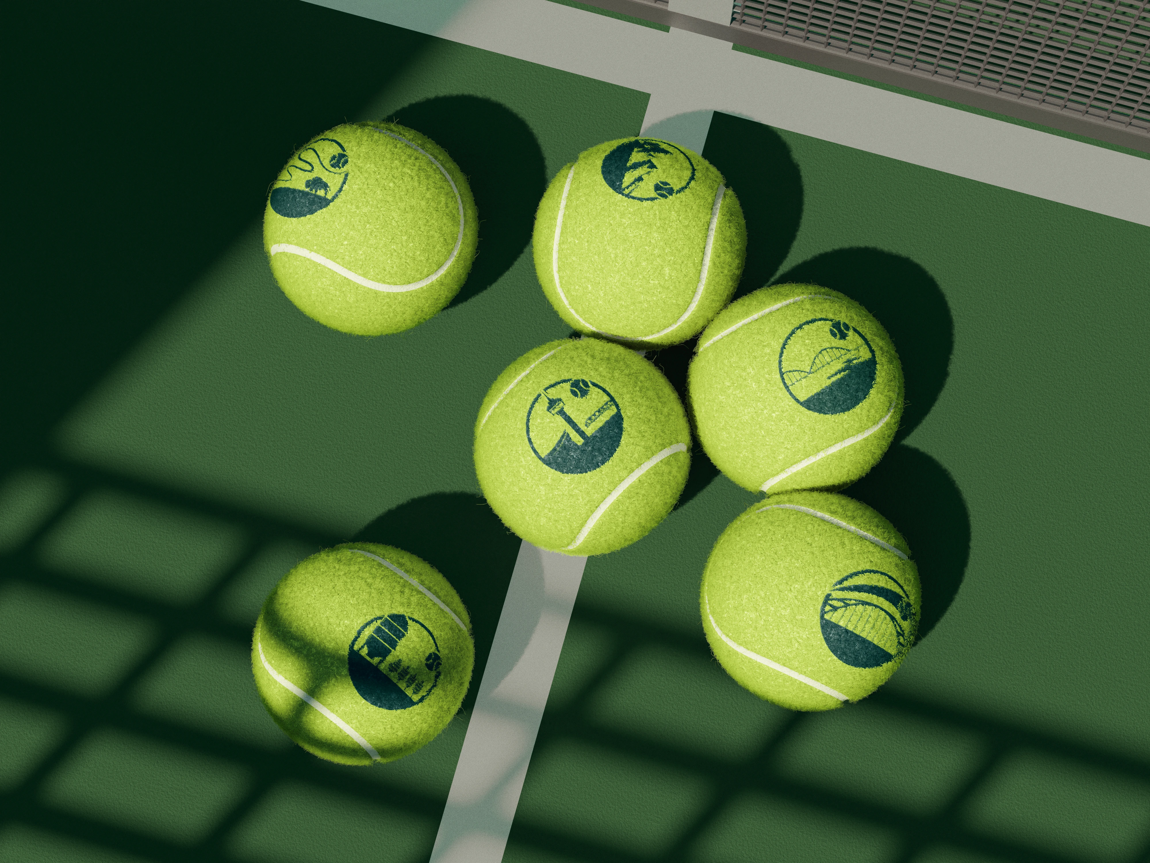
REgional icons were created based on landmark locations to bring them each an
identity and to easily distinguish them through tournaments.


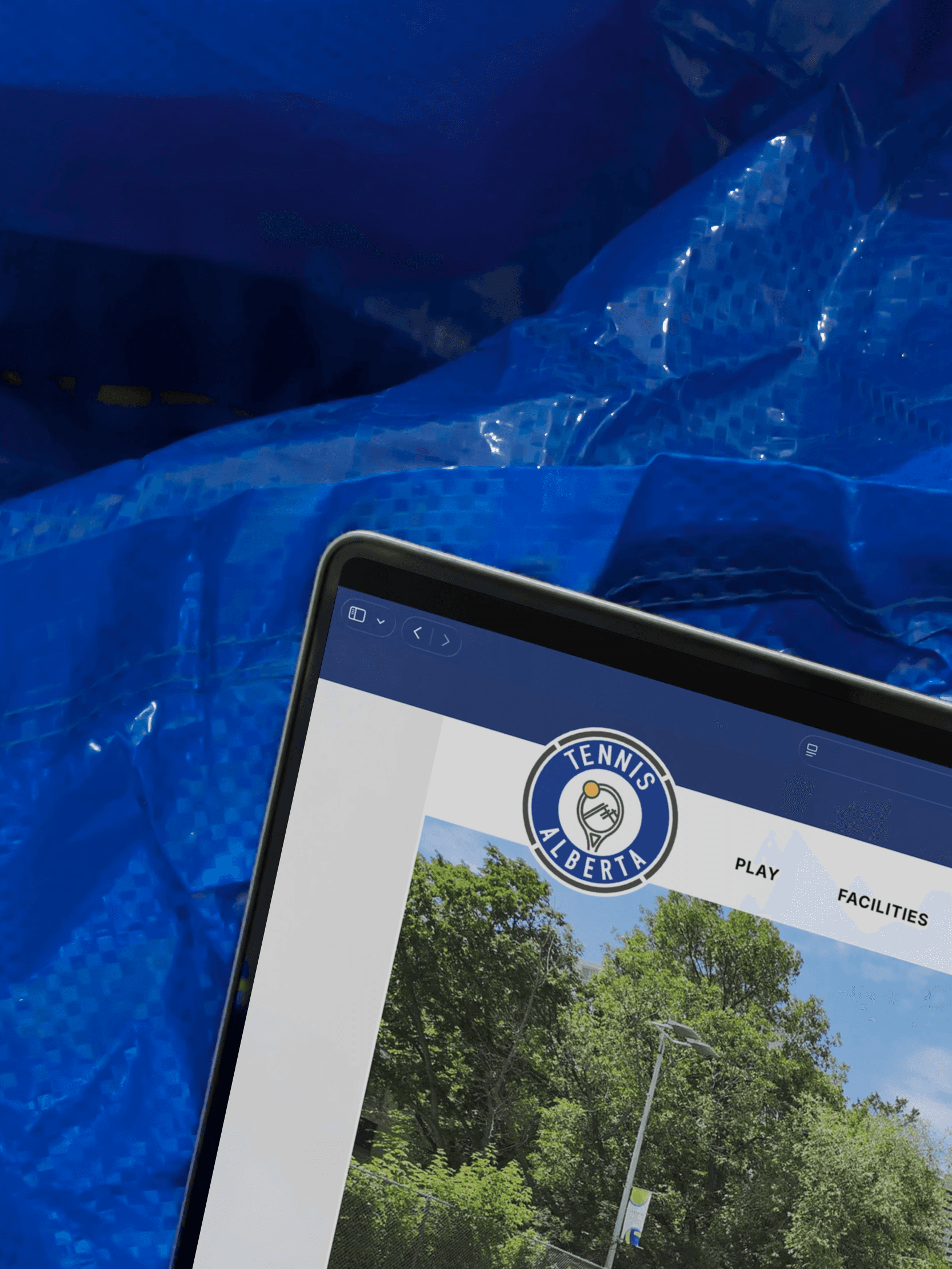

*Certain elements may have been adjusted and are not a full reflection of the approved design/assets. The purpose of this project entry is solely to accurately reflect current skills & design style.
©
2026